Design principles: choosing the right patterns

Design patterns are reusable solutions to common problems. They greatly speed up the design process, giving designers a common vocabulary of UI paradigms to work with.
But some patterns have become so dominant that designers default to using what everyone else is using, without really understanding if it’s the right pattern for their product or not.
Infinite scrolling where users need to jump back and forth between pages. Masonry grids for text-based sites where linearity is important. Hamburger menus where there’s enough space to list out the menu items. These are just a few examples of popular patterns being misused.
As designers, we can do a lot better, by understanding what patterns are appropriate to the specific problem we’re trying to solve. It’s easy for designers to simply default to what’s popular right now. We’ve already written about gimmicks and patterns in interface design, but it’s an issue in all areas of product design.
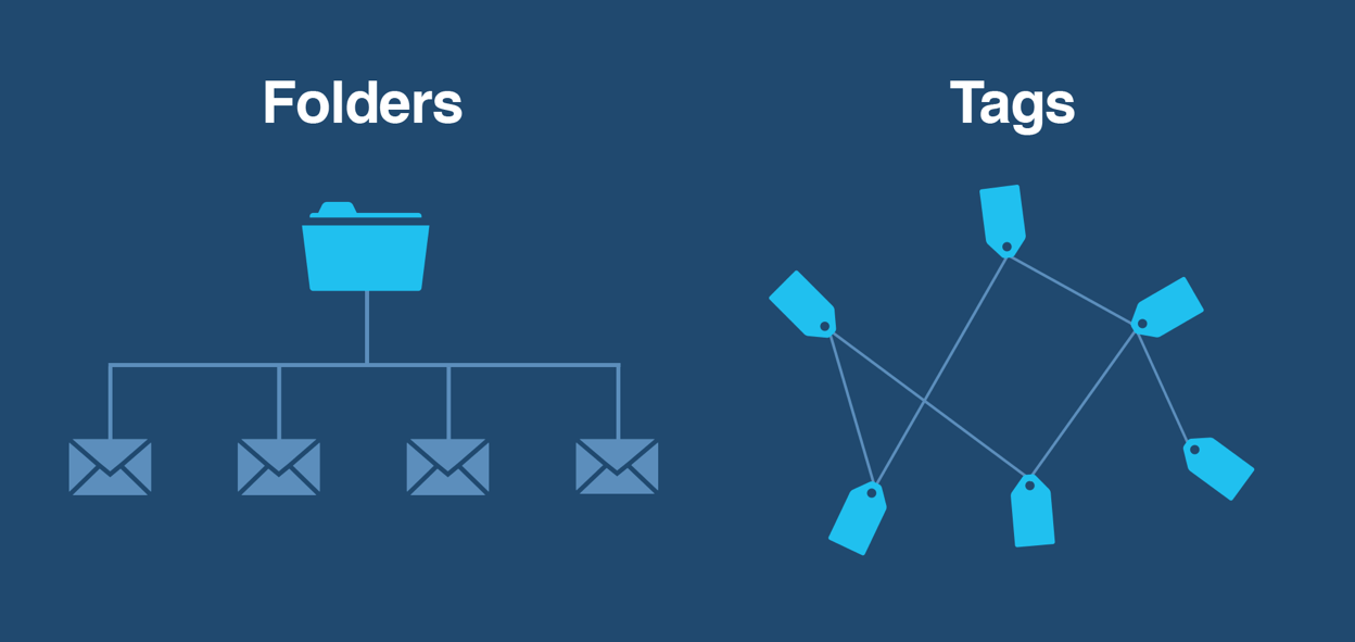
At Intercom, we recently encountered a situation where we had to choose between two commonly used patterns – folders and tags. By sharing how we made a decision about which was the best pattern to implement in our product, we hope to help you think a little deeper about patterns when faced with similar problems.
The project brief

Intercom lets you send messages to users at key points during their lifetime with your product, based on actions they’ve taken or when they meet certain criteria. These Auto Messages can be saved and will be sent to users as they meet the conditions that are attached to the message e.g. “paying customer” and “signed up less than 10 days ago” and “has used feature X”.
Until now, all of a customer’s messages were shown in a simple list view. That worked well as long as you only had a small number of messages that could be scanned at a glance. But as you started to create more and more messages, it became harder to keep track of them and how they related to each other. We needed to design a better way to organize them.
Assessing the dominant patterns
There are two dominant design patterns for organizing objects – tags and folders. But folders are from a different era, right? Tags were first popularized by Flickr and Delicious a decade ago and nowadays we see them everywhere. Tags have become so dominant, there have been heated discussions about whether folders are dying off completely.
The easy solution would have been to settle on tags, and jump ahead to designing the interactions. But we decided to go back to first principles, and understand what are the fundamental differences between tags and folders. In what context is one better than the other?

Design goal – one purpose per message
When communicating with your customers, it’s tempting to cover as much ground as possible, to throw in a research question with a new product announcement. But you will get better results if you target specific audiences, like asking the people who have used the new feature to give you feedback on it. We want to increase the success of our customer’s messages, and being able to associate a message with just one group reinforces this behavior. That way, you can have all your onboarding messages in one folder, and your research messages in another.
Design constraint – message volume
Intercom customers have anywhere between 5-100 live Auto Messages, so that’s the volume we needed to design for. Folders work well for this volume of messages. Folders are essentially designed for browsing, which most of us can do efficiently with up to 100 items. Tags are more efficient for larger data sets, as the dominant interaction is search. When you tag an object, you are effectively choosing the words that you might use to search for it at a later date.
Future proofing your designs
As we were defining the problem we were trying to solve and why, we also had to make sure our decision matched the long-term product roadmap. We’re planning to introduce a simple way to create a series of connected Auto Messages. A folder structure better fits into this model. If we were to introduce tags now, and later realized we needed a folder structure for sets of connected messages, we would introduce unnecessary complexity. We would have two similar, but very different types of objects.
Gmail suffers a similar problem; they have folders and labels that essentially do the same thing. This is one of the potential pitfalls of choosing a design pattern based on popularity. While it might seem an appropriate choice at the time, you should always consider how it might impact on your future product plans.
Patterns of patterns
Given the reasons above, we decided to use a very simple, one-level folder system for organizing Auto Messages. But even after deciding to use folders, we still had to choose the right folder pattern. Should they be expandable, go to a new page or should we use the master-detail interface? The design process didn’t end once we settled on folders. We had to adapt a pattern that met our own challenges. We had to understand the design goal and constraint, stay true to the future product roadmap, and then iterate on multiple different folder designs.
The result

In the end we launched a simple master-detail folder system for organizing Auto Messages. By understanding the advantages and limitations of existing patterns, we designed a solution that best solved the customer goal of organizing messages, fit the product goals and its constraints, and set us up for the future product roadmap. It’s not just our team who’ve struggled with the existing patterns of folders and tags. Post-launch, we were happy to find out that the folks designing Basecamp 3 came to a very similar conclusion when faced with a very similar problem.
Designers are faced with both big and small decisions like these every day. Should I use infinite scrolling or pagination? Avatars or names? Radio boxes or select boxes? Bad designers will mindlessly defer to what’s popular, what they’ve seen on Dribbble, or what they see in products every day. Great designers always start with first principles and carry them through their work. Understand what each pattern is best suited for, what their pros and cons are, and be confident in the choices you make.